Monday, February 22, 2010

Bathroom Inspiration

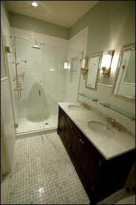
These are the images that serve as our bathroom redo inspiration. Our condo building is just over 100 years old. Because of that I really want to keep some of that vintage look alive throughout our house. So my plan for this bathroom is to do a vintage look with lots of updates. Each of these images below has done just that and done it extremely well if I may say so myself!

Mrs. Limestone

House Beautiful


The latter two via Rambling Renovators - We plan on doing a similar floor style to this couple with the basketweave surrounded by a thin border.

Decorpad

Gardenweb


Latter three from Velvet and Linen

Bathroom Redo

When we bought our home we knew one of the first major things we would have to do was gut and redo our master bathroom. As mentioned in the previous post the former owner redid the bathroom while she lived here and got rid of the shower leaving us just a tub, pedestal sink, and toilet. This definitely serves as a whole bathroom, but wasn't really useable for us in terms of showering daily, keeping things like toilet paper, toiletries, towels, etc put away. So as a quick reminder here was how our master bathroom looked (it was not pretty, not at all).


The tile was this awful pink/brown color, it actually looked a little like vomit. Very appealing.


Here is the Master Closet, and if you look in the picture above you can see it starts right outside the doorway next to the tub. Then if you exit the closet you are in our master bedroom.

So our plan with this space is to make the master bathroom larger by using some of the space from our huge master closet. I won't lie that we will miss some of our closet space, but I think the larger bathroom will be better for us both in terms of our use and hopefully resale value someday. It will be a ton of work, walls will be ripped down and moved, new walls will be built, the floors will be torn up, there will be dust everywhere and the sick part is that I cannot wait!

Here is the tile pattern we have chosen. It is the basketweave pattern with carrara marble with bardiglio marble dots. And hopefully a narrow border.

Lugarno faucet from Restoration Hardware

Inset medicine cabinet from RH.

Kent sconces from RH.

Volume control trim from Grohe
Thermostat control from Grohe (sorry for the small picture)

Here is what I think will be my favorite part of the shower - the Hansgrohe rain shower head!

Other plans include incorporating our washer/dryer into the space, a steam shower, two Kohler water tile shower heads (which I do not like the look of at all but my husband insists on), a Kohler hand shower, and a double vanity in a dark finish that we are yet to pick out yet. I wish it could be done about now, but it's certainly going to take a little bit of time and a whole lot of money! The biggest ordeal so far, atleast for me, is finding shower trim, hardware, accessories that all seem to flow together, it seems that each company has certain pieces that will go with the look I want but then other pieces in the collection we either don't like as much or for whatever reason we can't use in our space.

I'll be posting pictures of the demo very soon!

The Grand (or not so grand) Tour

It's about time we do the whole house tour on here. I'd love to call it the grand tour, except our home isn't very large and currently (I say currently in hopes someday this will be different) the decor is not so grand.

Our house is most definitely a work in progress and when we purchased it we (read, I) knew there were things that would absolutely need to be changed. Some changes have already taken place, some are in progress, and some are still many dreams away.

But here you go, our home.

To start with, a little description. We have a duplex down 2 bedroom condo. You enter our condo into our raised first floor which consists of our living room, dining room, kitchen, and 1 bathroom. Our lower level which is partially underground consists of our 2 bedrooms, 1 bathroom, and our laundry room.

When we moved in, our whole lower level was carpeted. Problem being that the previous owner had 2 cats and my husband is allergic - we had to remove the carpet immediately when we moved in. So that - and painting the two bedrooms was first priority.

Here is our Master Bedroom with the floors ripped out and ready to be painted.

Here we are with new paint and carpeting.

This canvas above the dresser doesn't really belong here. But I love it and this is its spot until I find a more permanent spot for it.

I do love our bedding in this room. I'm not so much a fan anymore of our all matching furniture set. My mom got this for me when I graduated college and I loved it at the time, now I'd love to do something very different. But in all honesty I'm sure that this room will be the last one we get to in terms of designing.

Our closet


Our not so mastery master bathroom. The former owner decided it would be a good idea to remove the shower and replace it with only a tub. Love the tub, don't love not having a shower on this level.


Our staircase which the carpet was ripped off of when we moved in 1 year and 4 months ago. And, yes, it still looks like this today. Plan is to finish the master bath and then do the stairs.

Here is our second bedroom/guest room/office space. The door you see here will be gone and drywalled when we are done rehabbing the master bathroom behind it. The hardwood floors are what we replaced the old gross cat carpet with in this room and I absolutely love them. They had to be engineered in order to be installed in this lower level.


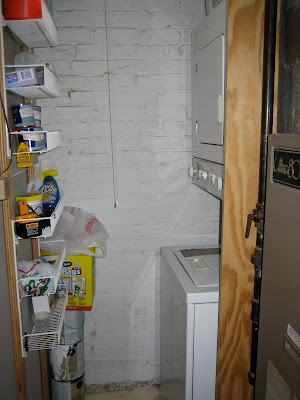
Here is our laundry/furnace room. It's certainly not the beautiful laundry room I dream of and have seen in numerous pictures around blog land. Also our washer/dryer is very sub par. It's about 5 loads to do 1 week of laundry. Oh, and it leaks out the bottom. Awesome.


The kitchen. It's looks good from afar but close up I'm not such a fan. We do have stainless steel appliances but they are certainly not high end. We have white cabinet which I love but they are not in great shape, and the way they are set up is not very efficient of the space. The counters are granite though and I do plan on keeping them when we redo this space. Also, I despise this paint color in here. Everyone always comes in and says I love this paint color. I just have to bite my tongue.


Look at all the wasted space beneath this counter!


Here is our Living Room space (photo taken from our dining room space). The little half wall you see actually surrounds the staircase that leads down to our lower level.


One of our favorite features of our home is our private rooftop deck. Here is our view!

So our home is clearly a major work in progress. I hope you enjoyed the tour and I hope you enjoy following us as we renovate/decorate this space!
Monday, February 1, 2010

And I'm Back.

Sorry for the long hiatus. The Holidays consumed me and then with the New Year came a not so lovely 5 day hospital stint for myself. And I spent the last few weeks trying to get well and get our life reorganized and back on track.

Oh, and we started a major renovation in our bathroom. Which has thus far been pretty consuming of my free time.

So you'll have to pardon me if some of my posts over the next couple of weeks are regarding things from December and January but I really want to use this blog as a way to track progress in our home and the random things I find in the world that I love.

The big push back into my blog was the lovely home of Anna Kohler. It is literally my favorite home I have ever seen. Since we purchased our home my inspiration has been torn between this very classic, neutral look and the traditional mixed with modern/eclectic look. This home proved to me that my true love is a mix of the traditional and the modern. If I could pick my dream home to move into this would have to be it. I love every single room. You know it's sad when you are hoping for photos of a laundry room and the rest of an office space. Nonetheless in case you haven't seen it on many of the other blogs who posted about it - here is the home as featured in Renovation Style.


I absolutely adore the classic wood work, traditional furniture, and pops of color and modernism in each space. Every room in this home literally makes me gasp in awe. I hope you have enjoyed it even a fraction as much as my self.